TL;DR – Mastering B2B landing pages
- Lead with clarity: A sharp headline that states the value in seconds.
- Keep copy simple: Benefit-first, scannable paragraphs and bullets.
- Make CTAs specific: Action verbs, clear outcomes, high-contrast buttons.
- Kill the nav: Remove nonessential links so visitors focus on converting.
- Test and learn: A/B headlines and CTAs; track form starts and submissions.
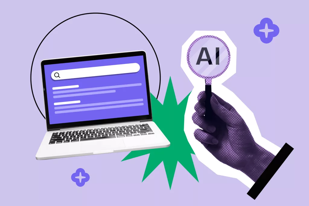
The journey from a curious click to a committed client begins with a single step – your landing page. Landing pages play a pivotal role in converting prospects into customers, making them the linchpin of your marketing strategy. You’ve invested time, effort, and resources in driving traffic to your landing pages; now, it’s time to make sure they perform at their best.
Ready for a few secrets that will supercharge your B2B landing pages? We’ll focus on three effective tricks to enhance their performance. From compelling headlines to persuasive calls to action, let’s look at how to turn your landing pages into conversion machines.
How do you write a B2B landing page headline that converts?
Imagine you’re at a busy trade show, and you have just a few seconds to capture the attention of a potential client. Your headline on a landing page serves the same purpose online. It’s the first impression, the initial handshake – the moment that can make or break the visitor’s decision to stay or leave.
A compelling headline is not just an ornament; it’s a strategic element with a specific role:
- Capture attention: In a digital landscape flooded with information, your headline should be a spotlight. It needs to cut through the clutter and seize the visitor’s gaze.
- Create interest: A great headline piques curiosity and lures the reader to explore more. It’s your invitation to a deeper conversation.
- Convey value: Your headline is a promise, a preview of what visitors can expect. It sets the stage for the value you’re offering.
- Establish relevance: It should instantly connect with the visitor’s needs or pain points. The more relevant your headline, the more engaged your audience.
Tips on creating attention-grabbing headlines
- Know your audience: Effective headlines are those that resonate with your target audience. Understand their challenges, desires, and what keeps them up at night. Tailor your headline to address these points.
- Be specific: Vague headlines leave visitors guessing. Get straight to the point and make it crystal clear what your landing page is all about.
- Use action words: Active verbs breathe life into your headlines. Instead of “Learn About Our Services,” go for “Supercharge Your Business with Our Services.”
- Inject urgency: If applicable, create a sense of urgency. Phrases like “Limited Time Offer” or “Act Now” can nudge visitors to take action.
- Keep it concise: Less is often more. A concise headline is easier to digest. Aim for clarity and brevity, typically around 6-8 words.
- A/B testing: Don’t be afraid to experiment. A/B testing allows you to find the perfect headline that resonates most with your audience. Test different versions, analyze results, and refine your approach.
What should your B2B landing page copy say to get more leads?
Your landing page is not the place for long-winded explanations or jargon-filled paragraphs. In the fast-paced digital world, your visitors want clarity and relevance, and they want it now. Here’s why concise and persuasive copy matters:
- Clarity: Visitors should instantly understand what you’re offering and why it matters to them. Clear copy removes confusion and encourages engagement.
- Engagement: Persuasive copy should speak directly to the visitor’s needs, desires, or pain points. It should evoke emotion and make them feel that your product or service is the solution they’ve been searching for.
- Conversion: Ultimately, your copy should guide the visitor towards taking action, whether it’s filling out a form, making a purchase, or getting in touch. Concise, persuasive copy is your best friend.
Tips for crafting focused and compelling copy
- Know your audience: Just like with headlines, your copy should be tailored to your specific audience. Understand their pain points, needs, and what they value most.
- Be concise: Every word should have a purpose. Eliminate fluff and jargon. Use simple, straightforward language that anyone can understand.
- Address benefits: Explain not just what you offer but why it’s beneficial to your audience. How will your product or service make their lives easier, better, or more profitable?
- Create a flow: Your copy should guide visitors logically from one point to the next. Tell a story that starts with a problem and ends with your solution.
- Use social proof: Incorporate testimonials, case studies, or client success stories. They add credibility and build trust.
Which CTA works best on a B2B landing page?
CTAs are your virtual nudge, your subtle suggestion that it’s time to move forward. They play several key roles:
- Focus: CTAs draw visitors’ attention to the most important action you want them to take, eliminating distractions.
- Guidance: They provide clear direction, ensuring visitors know what’s expected of them.
- Engagement: CTAs encourage interaction, whether it’s signing up for a newsletter, downloading a resource, or making a purchase.
- Conversion: Ultimately, the goal is to turn curious clicks into committed customers. CTAs are the gateway to that conversion.
Advice for creating compelling CTAs
- Clarity is key: Make your CTA crystal clear. Visitors should know exactly what will happen when they click. Use action-oriented language like “Get Started” or “Request a Demo.”
- Visually stand out: Your CTA should be visually distinct, using colors that contrast with the background. Ensure it’s easily noticeable without being obtrusive.
- Urgency and benefits: Create a sense of urgency or highlight the benefits of taking action. Phrases like “Limited Time Offer” or “Unlock Exclusive Content” can spur visitors into action.
- Keep it brief: CTAs work best when they’re concise. Avoid lengthy explanations and get straight to the point.
- A/B testing: Test different CTAs to see which ones perform best. Sometimes, a simple change in wording or design can make a significant difference in conversion rates.
Should you remove site navigation on B2B landing pages?
A cluttered homepage filled with numerous navigation links can be distracting for visitors, preventing them from easily finding what they’re looking for and potentially hindering their journey toward achieving the desired conversion. When a visitor lands on a post-click landing page, they typically have a clear objective in mind, and an excess of links can steer them off course. Remove click options that aren’t your CTA.
CTAs are the silent heroes of your B2B landing pages, ushering your visitors toward the desired action. With clarity, visual appeal, urgency, and brevity, your CTAs can transform casual clicks into meaningful conversions. A/B testing is your secret weapon to refine and optimize your CTA performance continually.
Keep it simple, keep it obvious, and get those landing pages converting!
B2B landing page FAQs
What belongs above the fold on a B2B landing page?
A clear value proposition, one primary CTA, and 1–2 trust signals (logo bar, stat, or proof) so visitors know what to do immediately.
Should I remove site navigation on landing pages?
Yes for most campaigns. Reducing links minimizes exits and keeps focus on the conversion goal.
How long should my copy be?
As short as possible, as long as necessary. Lead with benefits and use bullets to handle objections without adding friction.
How many CTAs should I use?
One primary CTA repeated where it makes sense (hero, mid-page, footer). Secondary links should be rare and clearly subordinate.
Which trust elements work best?
Client logos, brief testimonial quotes, partner badges, or a short proof stat tied to outcomes (e.g., time saved, ROI).
What should I A/B test first?
Headline clarity vs. specificity, CTA wording, CTA placement, and simple vs. enhanced social proof near the hero.